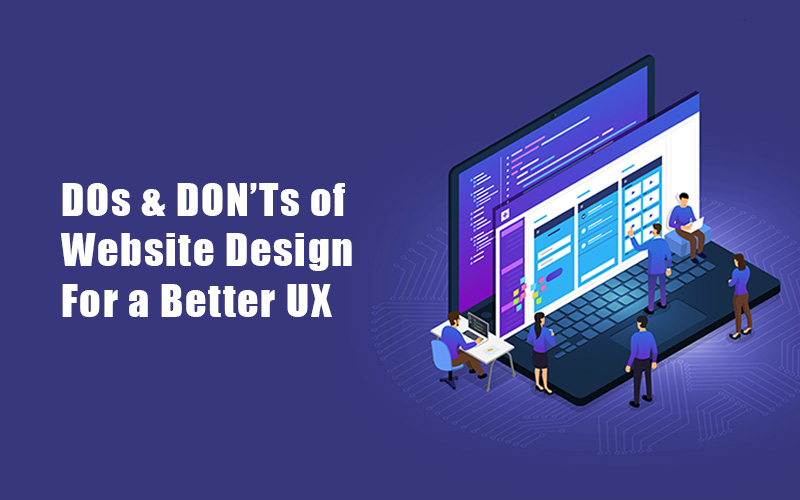
Planning to design a website with good user experience? Then this article is a must-read for you. In this article, we highlight some of the important dos and don’ts of website design.
If you’re a web designer, you know that website user experience is your top priority. User experience (UX) is one of the factors you need to consider to have a good website. For example, a visitor lands on a website with a colorful theme. The colors are all over the place without even having a focal point. This confuses the visitor and he might just leave the website for good.
If you see your website as a business investment, you should be careful of your web design. Keep your visitors engaged by providing aesthetics and functionality. There are effective ways to design your website, but some elements can have detrimental effects. Overdoing it might cause you problems instead of providing solutions.
Protect your website from faulty web design. Here are the dos and don’ts of website design that you would want to remember-
DOs And DON’Ts Of Website Design
1. Interface
DON’T: Change your interface too often.
One of the things that website owners do is update their website. This is a healthy practice but changing the overall feel of your website may lose you some visitors. A monthly change in the typeface that you use can be confusing. Changing your color scheme too often can be confusing as well. These practices will make you lose your visitors.
DO: Make a solid interface that you can use across your website.
Be consistent with your interface. Make an interface that you can use across your website. Design an interface that is user-friendly and usable. Be consistent with the typeface that you want to use. If your blog titles are in a bold sans serif typeface, this should be the typeface for every blog title.
The color scheme that you use should reflect the message of your website. For example, if you’re running a website for marine life, using the color green could be confusing for visitors.
Lastly, your web design should have a purpose. Every element on your website should have a purpose. Once your website is usable, stick to your web design.
2. Navigation
DON’T: Make it hard for your visitors to navigate your page.
The last thing you’d want is for your visitors to get lost inside your website. This happens when your website has a poor navigation mechanism. Don’t make your visitors think about how they will navigate your site. You’re making it harder for them to stay.. If your website is hard to navigate, the next choice for your users would be to leave.
DO: Include plugins for easier website navigation.
If you’re working on a WordPress website design, you are in good hands. WordPress has plugins for navigation that you can incorporate into your site.
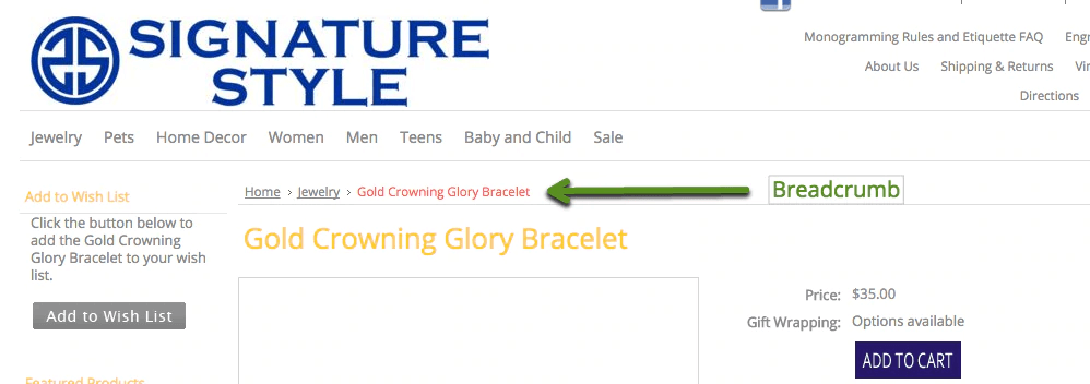
Everything on your website should be easily accessible on your homepage. You’d want your visitors to know more about your company. An “About Us” navigation button is what you need.
Your readers should not have to spend time finding your contact information. Navigation through your website should be easy. This results in a good user experience.
3. Layout
DON’T: Make a cluttered website.
Yes, you should make everything accessible on your landing page. There is so much information that you need to relay to your visitors. And there is so little time to do this mammoth task. A common mistake that web designers do is making a cluttered website. Too much information in an area is confusing for the eyes.
Your visitors won’t know where they will direct their attention. Your website will be visually confusing for them. They’ll just leave your website the moment they see it.
DO: Create a focal point using your layout.
When scanning a website, your eyes have a reading pattern. These reading patterns are:
- F-scanning pattern
- Z-scanning pattern
The F-scanning pattern is often used for websites that use a lot of words. On the other hand, the Z-scanning pattern works best with minimal text.
Z Scanning Pattern
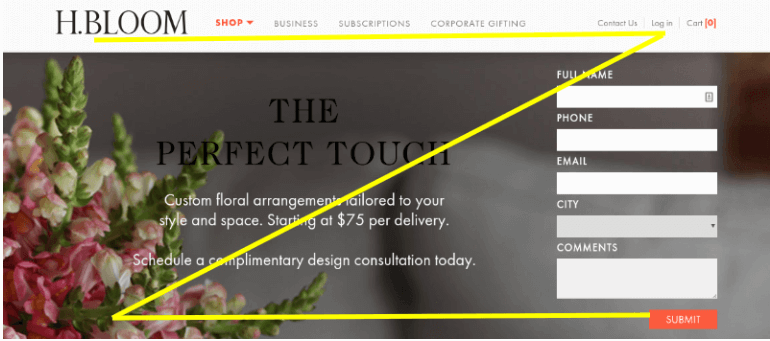
These patterns will help you set up the layout for your website. Applying the F and Z patterns for your layout will help your website. These patterns will direct your visitors’ eyes straight to your calls-to-action.
4. Aesthetics
DON’T: Overdo!

I don’t know what’s happening here. Everything is all over the place and my eyes don’t know where to look. Where do I sign in? What is that image on the bottom right for? There are no spaces in between every element. This makes the landing page too crowded. Well, it is. And worse, much of the text is unnecessary.
This is so saturated with words. This leaves zero breathing room for each element. If you have this kind of website, it’s time to change it.
Lastly, there are no focal points established on this landing page. Even the size of the fonts used has no differentiation across the page. This web design failed to give a clear message to its visitors.
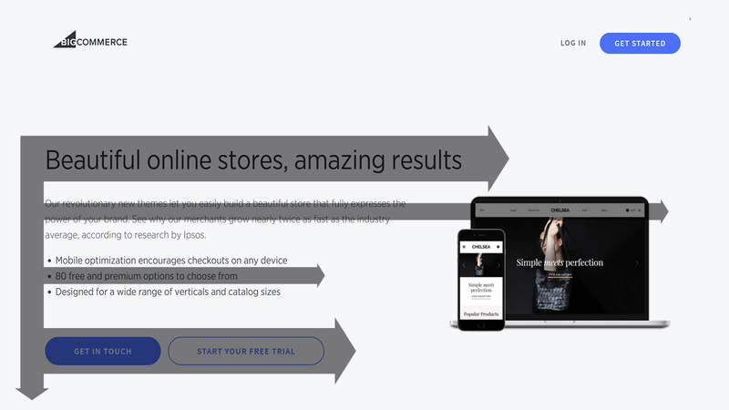
DO: Make your website visually appealing.
Words declare what you want to say to your audience. Just remember to limit your typefaces to three. One for the main heading, one for the subheading, and one for the body. You can use images to replace words. Images tell stories. If you want to increase your website’s aesthetics, you can use more images.
Don’t use stock photos on your landing page. Use images that are suitable for your message. You can even curate photos to match your brand design. Your website should be designed for its purpose. Make it clear for the audience to get your message and enjoy a good user experience while visiting your site.
DO: Optimize your images and videos.
Images and videos make your website load more slowly. The size and quality of the image/video affect the loading time of your website. Make sure to optimize your images and videos for faster loading time.
5. Content
DON’T: Ignore the quality of your content.
You cannot ignore the quality of your content just because you have photos. Your content is the bread and butter of your website. No matter how beautiful your website is, it will fail without quality content. Content goes hand in hand with the design. And design should complement the content, not overpower it.
DO: Provide valuable content.
The attention time of people online is very short. With so much information on the internet, there’s only a little time to go through everything. Your visitors will only stay if you have interesting content. Make sure your content packs a punch. Make it concise and easy to understand. Make it work hand in hand with your design. Write subtle but engaging content. This makes your visitors more interested in your content. But always make your message clear.
Your visitors will appreciate high-quality content. Even if your design is not as flashy as the others, your users will still patronize your website because of your content.
Test it out!
Your website becomes too familiar to you if you’re the one that designed it. Take it out for a ride. Have other people view your website. Listen to their feedback and optimize your site again and again.
Your goal is to offer an outstanding user experience. These DOs and DON’Ts of website design will help you stay efficient and functional online. You’ll have a user-friendly, highly-converting, and good-looking website in no time.