Multiple factors affect the conversion rates on your website. One of which is the Website User Interface design. In this article, we highlight some of the important web design tips that you must follow to improve the conversion rate of your website.
Your site’s user interface plays an enormous role in its ability to turn visitors into customers. A conversion-focused UI subtly urges a user towards action. It makes use of every visible element on your website to increase the chances of a sale. Have you done everything you possibly can to ensure your website is optimized for conversion?
In this article, we’ll take a look at some important web design tips, business owners can do to maximize their website’s conversion potential.
Six Important Web Design Tips For Increasing Conversion Rates
1. Lead with a Compelling Sales Pitch
Everyone who lands on your site will see the hero header. This is the perfect place for a single-sentence sales pitch that clearly communicates what your product will mean for the customer. If it doesn’t contain an obvious reason why your products are better than your competitors’, you’re wasting the most important piece of website real estate.
Take a look at how “Fantasy Jocks” does this on their homepage.
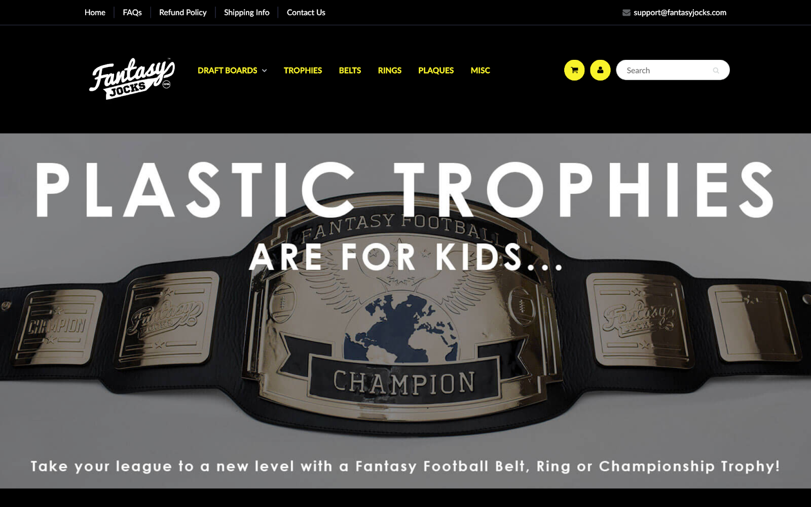
After reading just five words, visitors know why they should spend money here. That is why you should have web design ideas. – “Plastic trophies are for kids.” This is simplistic conversion genius.
2. Have a Clear, Early Call to Action
In many cases, your website won’t have to do much “selling” before a visitor is willing to pull the trigger. Sometimes, the marketing material that’s brought them to your website has been enough to convince them to make a decision.
This is especially true for offerings that have a trial period. People may be more willing to simply sign up for a free trial of your product rather than wade through page after page of marketing material.
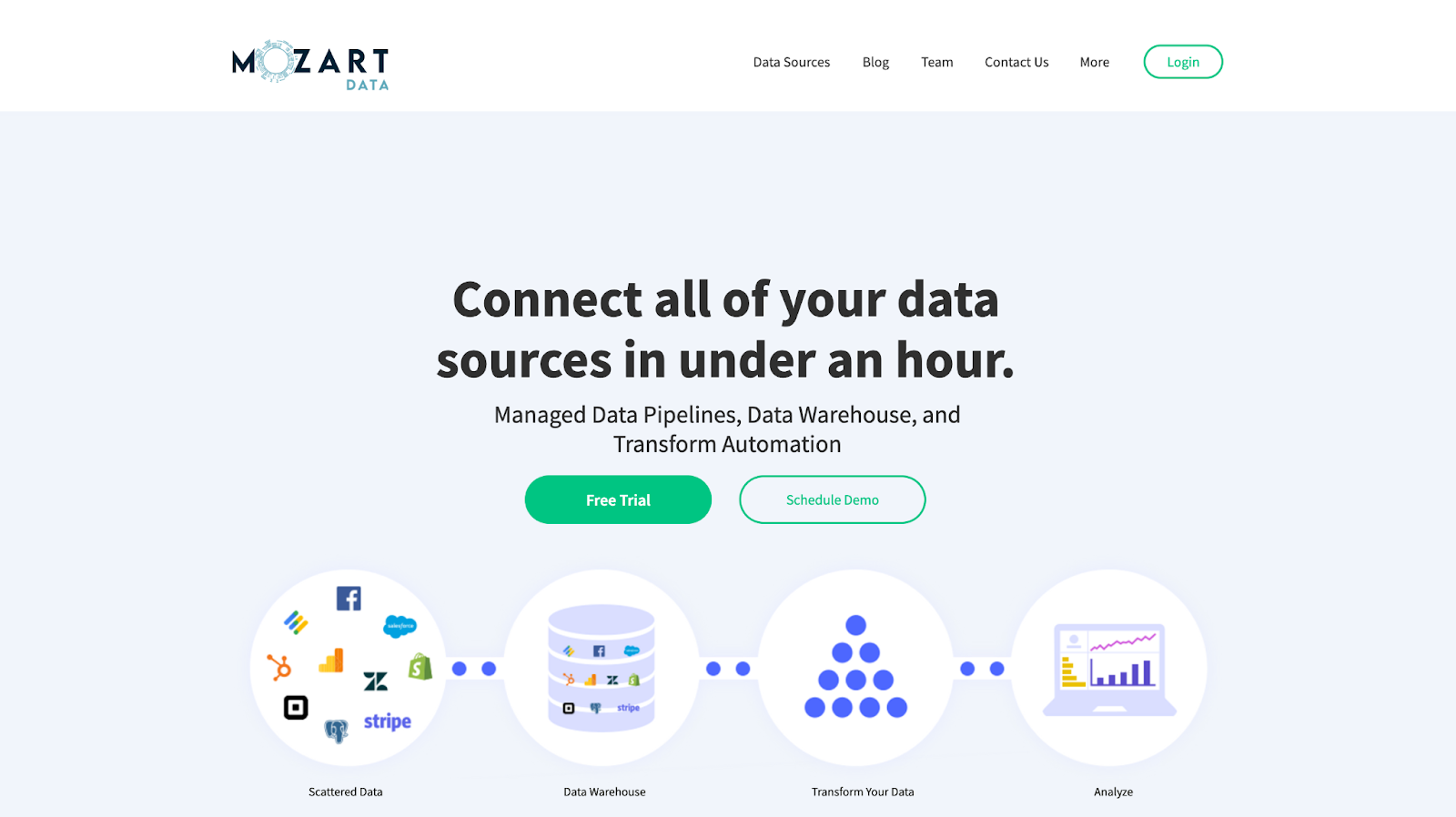
Mozart Data does a great job of this on their homepage. Right beneath an excellent description of the company’s value proposition, the site designers were smart enough to include two prominent calls to action, both making an early conversion highly likely.
3. Respect Your Visitors’ Time
People don’t read entire web pages anymore. This is a problem for affiliate websites that have a strong relationship between conversion and content consumption.
For these sites, the sale often happens as the user is reading a review or product description. If users are skimming or skipping sections of content they find redundant, they may lose interest in the page before finding a product that’s perfect for them.
Take a look at how Each Night solves this issue in their fairly lengthy “Best Mattresses of 2021” review post.
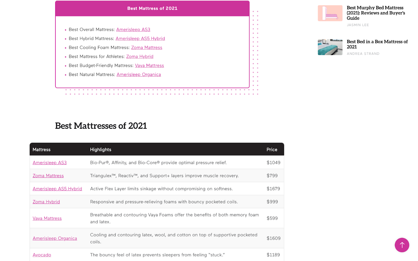
Instead of forcing users to read every word about every single product, the designers have included a super convenient comparison table at the top of the piece.\ This allows their prospects to get an idea of which product is right for them at a glance. It also significantly reduces the amount of time they have to invest on the page before making a decision.
4. Make Sure Your Site Is Responsive
Since 2014, mobile web browsing is more popular than browsing on a desktop device. People are happily using their smartphones and tablets to perform all the tasks they used to do on their laptops. And that includes shopping.
If your website is displaying its desktop version on users’ mobile devices, you will lose out on sales. This isn’t a hunch – research has consistently shown how unresponsive sites deliver poorer conversion rates.
Visitors get annoyed quickly, and if they have to zoom in on small text, or they have to drag across the interface to find the “add to cart” button, they are far more likely to leave than they are to complete their purchase.
Take a look at “A Book Apart” for an example of a website that delivers a seamless mobile browsing experience.
5. Shine a Spotlight on Social Proof
Make positive reviews and testimonials a very prominent part of your website’s front-end. Most first-time customers want to see that your brand can be trusted before they give you their payment details. Even better than giving curated testimonials is involving a reputable third-party review like Google Reviews.
Trustpilot is another consumer review website that is fast becoming one of the most trusted sources of verified social proof.
When customers see that your site’s reputation is backed up by a globally recognized brand, your credibility will shoot through the roof. You’ll have removed one of the biggest obstacles to conversion.
6. Don’t Be Afraid of Negative Space
Visual clutter distracts a user’s eye from elements that drive conversion. If you cram as many images, buttons, lines of text, and forms into the empty spaces on your web page, your visitors are likely to miss the most important messages and calls to action.
Don’t fall into this trap. Keep your visitors focused on the crucial components of your site. This is especially true for ecommerce product pages where a very simple design can be used to great effect.
Take a look at how online luggage retailer, Away, does this on their product pages. Above the scroll line, real estate is mostly taken up by white space and elements that are absolutely essential to conversion.
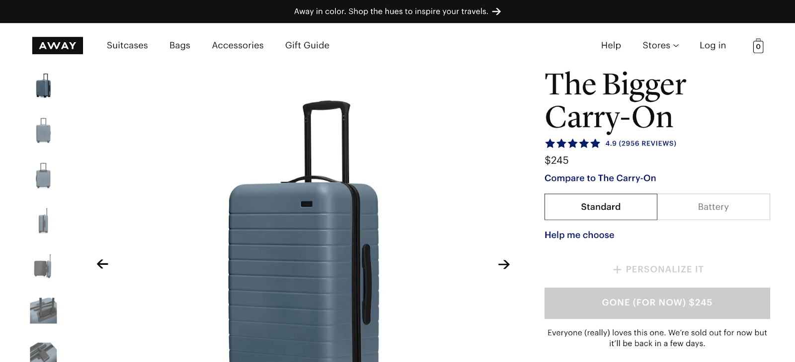
As the user scrolls down, white space decreases, but the screen remains mostly uncluttered. Large product images take up the screen, but the text is used sparingly so that the user’s eyes remain focused where they need to be.
In Closing
Think of your site, especially specific pages on your site, as the final step in your sales process. Think of it as the last sales pitch you’ll make to a potential customer. Everything you’ve done up to that point has just been preparing them for this interaction.
Don’t drop the ball here. Instead, go over every single element on your website and make sure that it plays its role in nudging your visitors towards a decision.
The web design tips we’ve talked about here are a great place to get started, but this is an ongoing process. Never stop assessing your site’s capacity to convert. There’s virtually always room for improvement 🙂
Like this article? – You might also like to read “5 DOs and DON’Ts of Website Design For A Better User Experience“