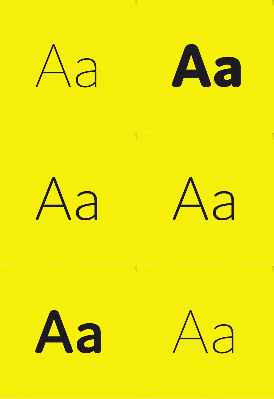
Have you ever looked at a piece of content and thought, “What a mess! Where do I even begin?” If you have, then the most probable cause has to be muddled visual / font hierarchy.
When you saturate a page with multiple fonts, styles, colors and font sizes, you are destined to end up with a nasty looking page and uninterested visitors. Many might even consider you spammy! What your page needs is careful love and attention, not to mention discipline and a hierarchy. Here are a few tips to help you add some much needed font hierarchy to your content.

1.Understand Your Content – Instead of simply copy pasting chunks of content on your page, take time to actually read and understand it. How else will you determine what is important and what isn’t? Take the examples of books – they have titles, subtitles, paragraphs and sections all neatly arranged in descending order. Each chapter is on a new page and the index is easy to navigate. The user experience of a neat hierarchy is smooth and effortless but does take effort to create.

2. Use Spaces Wisely – Spacing can literally make or break your content. Use spaces to your advantage. Make sure the space between two topics is bigger than the space between a heading and its corresponding text. Use it to create a stark distinction between sections and paragraphs. This increases readability and the content does not seem like an endless marathon to the reader. Look at these 2 examples and decide which looks like a sprint, and which looks like a marathon?
Personal Introduction-Hi my name is John. I am a graphic designer with 12 years of experience. I am also a football enthusiast.
Personal Introduction
Hi my name is John. I am a graphic designer with 12 years of experience. I am also a football enthusiast.
3. Go Large or go Home – It’s simple. Use font size 16 for your content body. Sounds a bit much? It’s actually not! See what usability expert Oliver Reichstein has to say – “16 pixels is not big. It’s the text size browsers display by default. It’s the text size browsers were intended to display… It looks big at first but once you use it you quickly realize why all browser makers chose this as the default text size”. Our psychology is such that smaller typography will make us lose interest in minutes. Whereas bigger fonts are more likely to be read to the end. [Vogue uses a 19px body text size!] Which of these test sizes catches your eye?
Hi my name is John.
Hi my name is John.
4. Choose Complimentary Typefaces – Effectively combining different typefaces is a skill that requires instinct and basic visual sense. Keep in mind the context of using the typefaces, the theme of the website, its surroundings and mood of the text. Create contrast with thickness and color. Make sure you highlight what is important and what isn’t. But use contrast carefully. Avoid throwing modern fonts together with vintage or comic ones only because they have similar thickness. Also don’t try to combine circular fonts with square ones. Try using fonts with the same height.
5. PRO TIP – Always choose your title font first. Experiment with it and then finalize the 2nd text font. Avoid using more than 2 fonts in a piece of text. Remember that less is always more. Two fonts/styles/colors will always give a classier effect to your content that 5 multicolored fonts. Look at these 2 examples and decide for yourself which looks better and which one gives you a headache?
Personal Introduction
Hi my name is John. I am a graphic designer with 12 years of experience. I am also a football enthusiast. I also like to play the guitar.
I am currently perusing my Master’s degree in graphic design.
Personal Introduction
Hi my name is John. I am a graphic designer with 12 years of experience. I am also a football enthusiast. I also like to play the guitar. I am currently perusing my Master’s degree in graphic design.
We can only conclude with what we started. Font hierarchy is everything! Using it wisely brings order whereas ignoring it will only result in chaos. Experiment, learn, and most importantly – PRACTICE! Do you have additional tips to improve typography hierarchy? Let us know in the comments! We’re all ears.


