Do you feel like your designs are incomplete? chances are, your background is too dull and you don’t even realize it!
We focus on the bold elements of the design but it’s the often-overlooked background that sets the stage, whispers the mood, and gives your designs a depth.
But fear not! In this blog, we’ll explore different backgrounds that will help you enhance your designs and take it to next level.
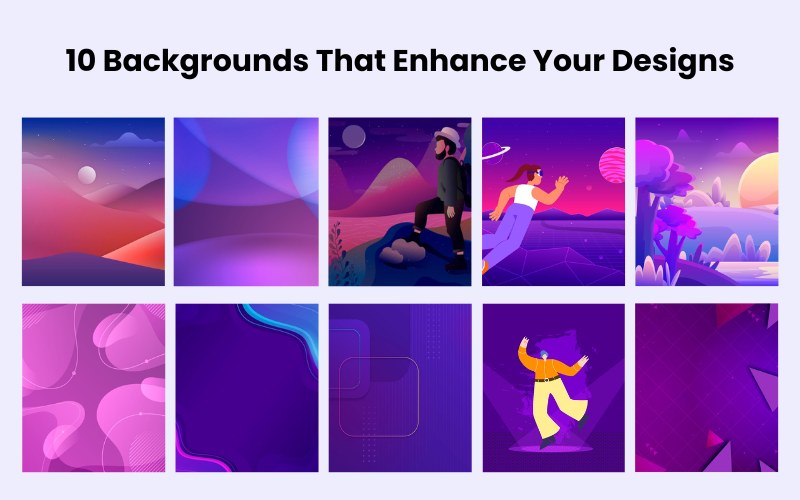
10 Backgrounds That Enhance Your Designs
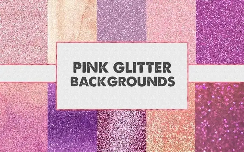
This pink glitter background adds instant sparkle to your designs and makes it pop, it works perfect for creating invitations, social media posts, or adding a touch of whimsy to any project.
Specifications:
- Resolution – 300 dpi
- Dimensions – 4000 x 3000 px
- Instant Download
- Extended Commercial License
Pricing: Free
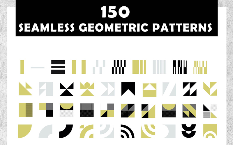
Download these high-quality geometric backgrounds and build designs with clean lines and vibrant colors. Ideal for minimalistic designs, eye-catching social media posts and edgy projects.
Specifications:
- Dimensions – 500×500 px
- Instant Download
- Extended Commercial License
Pricing: $8
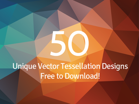
These tessellation backgrounds will give your designs the hypnotic charm of repeating patterns. perfect for adding visual depth to any design. Create printables, invitation cards, Banners, and posters and a lot more.
Specifications:
- Dimensions – 2560×1440
- Instant Download
- Extended Commercial License
Pricing: Free
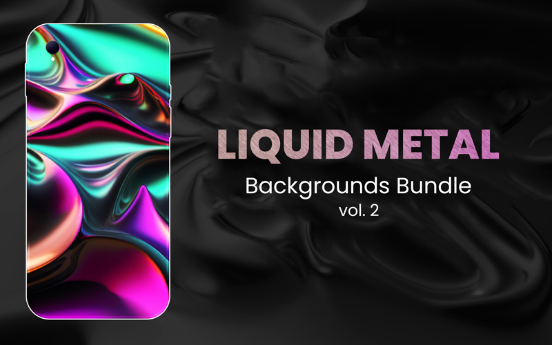
Give your designs a touch of captivating and futuristic look with these engaging liquid metal backgrounds. Perfect for creating posters, graphics, presentations, social media posts, print materials, and more.
Specifications:
- Dimensions – 3000 X 2000 px
- Instant Download
- Extended Commercial License
Pricing: $15
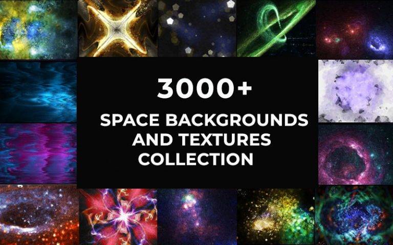
Dive into the depths of the universe with this space background bundle. Add a touch of cosmic beauty to your designs and craft captivating flyers, space-themed projects, and Sci-fi invitation cards.
Specifications:
- Dimensions – 4096px x 2160 px
- Instant Download
- Extended Commercial License
Pricing: $19
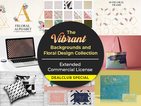
Download the floral design bundle, perfect for giving your designs a touch of softness or evoking a sense of zen. You can craft invitation cards, social media posts, cute printables, website banners, enchanting artwork, and a lot more.
Specifications:
- Resolution: 300 dpi
- Dimensions – 3000 x 3000 px
- Instant Download
- Extended Commercial License
Pricing: $15
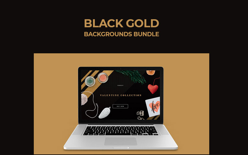
Download the high-resolution black and gold background bundle and create masterpieces that represent wealth and luxury. Craft print designs, website backgrounds, postcards, elegant business cards and more.
Specifications:
- Resolution: 300 dpi
- Dimensions – 4000 x 3000 px
- Instant Download
- Extended Commercial License
Pricing: Free
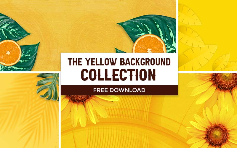
Add the warmth of sunshine and the freshness of sunflowers to your designs with the yellow background collection. Create unique invitations, gift cards, greeting cards with comforting patterns that make your creation pop.
Specifications:
- Resolution: 300 dpi
- Dimensions – 4000 x 3000 px
- Instant Download
- Extended Commercial License
Pricing: Free
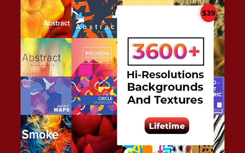
Unleash the inner punk with these grunge backgrounds. Distressed textures, bold scratches and rebellious color that pop instantly when added to any project. You can create website and app designs, posters, flyers, and more.
Specifications:
- Instant Download
- Extended Commercial License
Pricing: $39
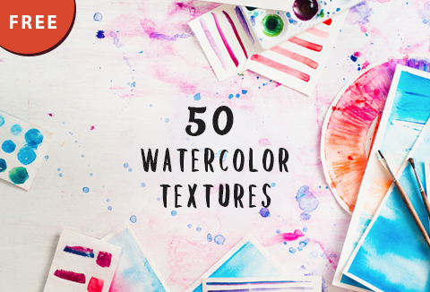
Download these watercolor backgrounds and textures and make your designs look artistic and aesthetic. Make the colors blend perfectly with your designs and create eye-catching greeting cards, wallpapers, artwork, and a lot more.
Specifications:
- Dimensions – 1500 x 1000 px
- Instant Download
- Extended Commercial License
Pricing: Free
Tips for Using These Backgrounds
1. Intricate Background + Detailed Elements = MESS
Decide on the hero of your design and create focus. Detailed elements need simple backgrounds, and intricate backgrounds need simple elements. Rule of thumb – “Less is more”. Do not let your visual hierarchy suffer.
TIP – Use simple shapes and a solid background for a proven, neat, and clean design.
2. When Using an Image as a Background – Blur it!
Images can create a beautiful vibe around a design. At the same time, the details in the image can be quite distracting! How to get the best of both worlds? Take a perfectly blurred background image! That way, the audience still knows what the image is about, it creates the mood that it is supposed to, but the element still remains the hero!
TIP – Do not over-blur the image. Make sure you still preserve the shapes and textures in the background.
3. Use Glitter to make it Fancy!
Glittery backgrounds can scream “over the top”! But if used well, it can be classy without blinding the viewer. The trick is to keep your text and remaining elements simple and sober.
TIP – Try using a gradient for the glitter. This way, you also get to use the non-glittery part to highlight other elements.
4. Apply a Color Overlay.
Is it possible to use an image as a background, but at the same time stick to a color theme? ABSOLUTELY! Applying color overlays to text or images in the background instantly makes it subtle and soft, while still showing off the details of the image.
5. Use Textures as Backgrounds
The best way to keep your background simple, whilst adding depth and a rustic feel is to use textures as backgrounds. These add a powerful effect while also highlighting the other elements. A few good examples [depending on your theme] are wooden textures, paint textures, paper texture, metal texture and so on.
Conclusion
I hope these backgrounds would help you create designs that satisfy you and captivate your audience .
Each of these backgrounds can give your designs a unique look and make them pop.
If you think we’ve missed any background that would’ve been worth putting in the blog, let us know in the comment section below!