
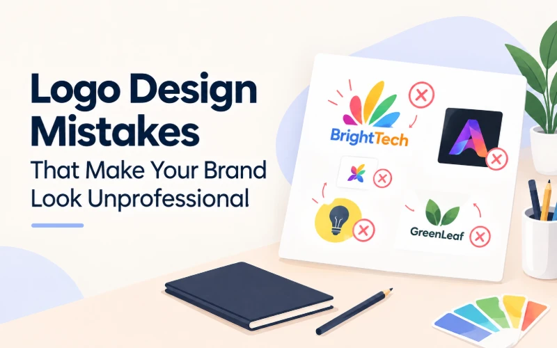
Before anyone reads a word on your website, they see your logo. Your business logo is the first handshake between your business and a stranger, which happens in about two seconds.
A few small but common mistakes can quietly undercut that handshake.
None of these mistakes requires a redesign from scratch. Most are a quick adjustment once you know exactly what to look for in your own logo.
Below are the five most common logo design mistakes, paired with a quick fix for each. Look at your own logo as you go through this list. Chances are, you’ll recognize at least one, and that’s completely normal. Almost every business owner does, especially anyone who built their first logo alone, without a design background to lean on.
5 Logo Design Mistakes To Avoid
1. Too Many Colors or Fonts
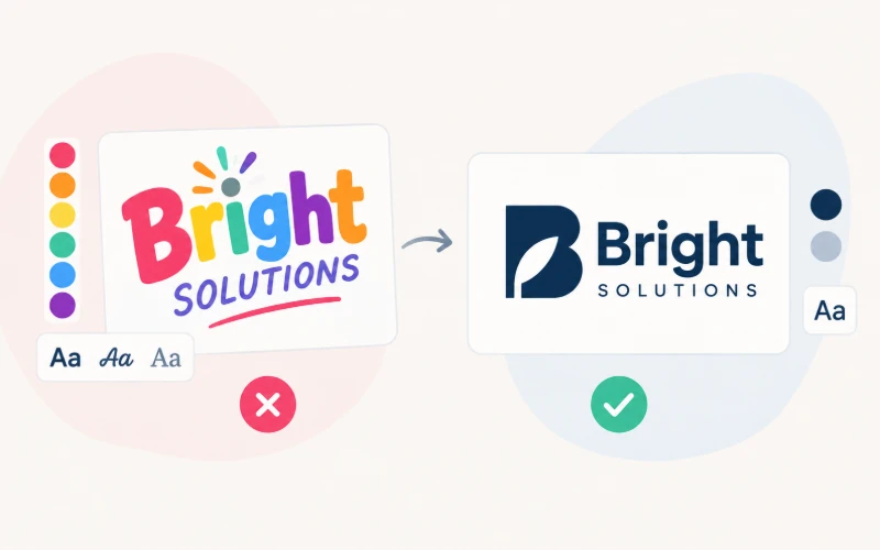
Mistake: Open your logo and count the colors. Then count the fonts. If you’re past two or three of either, that’s likely an unprofessional logo sign quietly dragging your brand down.
Fix: Pick one or two colors and one font family, and build the whole mark around that limit. A tight palette reads as intentional and confident. A crowded one reads as unfinished, even when the individual choices look fine on their own screen.
2. Illegible at Small Sizes
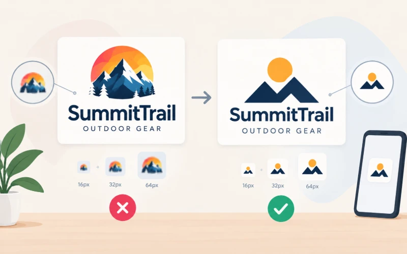
Mistake: Shrink your logo down to the size of a favicon. Then squint at it from across the room. If the details blur into a smudge, your logo fails what’s often called the small size test, and most visitors will only ever see it that small.
Fix: Simplify the mark until the core shape still reads clearly at a tiny size. According to Canva’s guide to logo design principles, something bold and simple is far more memorable than something packed with detail. Save the fine details for your website and packaging, not your logo itself.
3. Chasing Trends Instead of Building a Timeless Mark
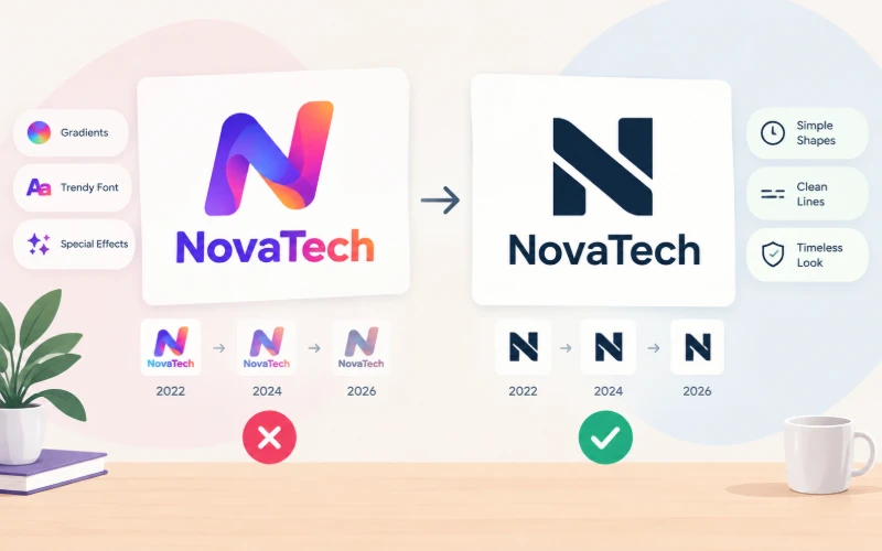
Mistake: Gradient overlays, one specific bevel effect, a font style everyone used two years ago. Trend-driven choices look current for a season, then dated fast, often faster than you’d expect.
Fix: Build around simple shapes and clean lines that don’t depend on a passing style. A timeless mark still looks right in five years, without a costly redesign or an awkward “we’ve rebranded” announcement.
4. No Real Connection to What the Brand Does or Feels Like

Mistake: A generic icon that could belong to almost any company in any industry. It doesn’t hint at what you sell or how you want customers to feel when they find you.
Fix: Before you design anything, write down your brand’s personality in a few words. Playful, trustworthy, premium, approachable. Let that guide your shapes, colors, and tone, rather than just your personal taste that day.
5. Using an Overused, Generic Stock Icon
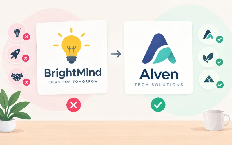
Mistake: A light bulb for “ideas.” A rocket for “growth.” A handshake for “trust.” These icons are common across so many industries that they’ve stopped meaning anything specific to your brand.
Fix: Build a mark from your initials, a custom shape, or a simple abstract form instead. It won’t get mistaken for ten other companies in your industry, which is the whole point of having your own logo. A distinct mark also ages better, since it isn’t tied to whichever icon set happens to be popular this year.
How to Avoid These Without Hiring a Designer
You don’t need design training to avoid this entire list. Knowing how to design a logo without a professional background really comes down to preparation, not talent. You need to answer a few questions clearly before you start.
Know your brand personality first. Three words that describe how you want to come across to a stranger. Know your industry context too, since a law firm and a bakery shouldn’t look anything alike, even if both owners like the same shade of blue. Have a rough color direction in mind, even a loose one like “warm and earthy” or “clean and modern.” And know your audience, because a logo built for teenagers and one built for retirees rarely succeed with the same choices, no matter how well either one is drawn.
These four inputs are the real foundation behind good DIY logo design tips, whether you’re sketching by hand or generating concepts with AI.
One more note worth being upfront about here. However you generate your new logo, run a quick trademark search before you commit to it.
Try It Yourself
You don’t need years of design experience to get this right. DealFuel’s free Brand Logo Playbook walks you through those same four questions, then turns your answers into a ready-to-use prompt for Claude Design.
Want a logo that avoids all five mistakes? Open the free Brand Logo Playbook and generate professional logo concepts with Claude Design today.