

Mobile app UI design requires precision, creativity, and user-focused thinking. The difference between average and exceptional apps often lies in design quality. Current statistics show impressive market growth potential.
In the 4th Quarter of 2024, consumers globally spent over US$ 35 billion. The average smartphone user engages with 10 apps daily.
This represents a massive opportunity for well-designed applications. Let’s explore the complete mobile app design process from initial concept to polished product.
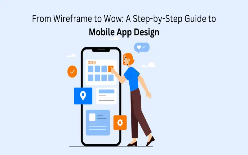
Guide To Mobile App Design
Understanding Your Users
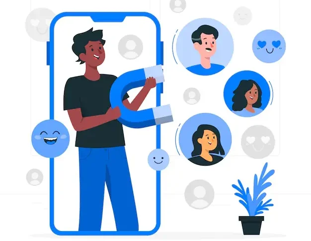
Target Audience Analysis
Define your ideal users with specific demographic and psychographic details. Create detailed user personas that represent key audience segments. Personas should include age, occupation, tech comfort, and pain points. Research by Nielsen Norman Group indicates persona-driven design improves user satisfaction by 33%.
User Journey Mapping
Map potential user interactions from first contact through continued usage. Identify key touchpoints, pain points, and emotional responses. A Forrester study found that companies using journey mapping see 54% greater returns on marketing investments.
Pro Tip: Interview at least 5-10 potential users before starting design work. Their insights will reshape your assumptions dramatically.
Planning Your App Structure

A logical app structure forms the backbone of intuitive navigation. Several planning techniques help organize your app effectively.
Information Architecture
Create a hierarchical diagram showing how screens connect logically. Group related features and establish clear navigation paths. The Information Architecture Institute reports that proper IA reduces development rework by up to 40%.
User Flows
Chart the step-by-step paths users take to complete key tasks. Identify and eliminate unnecessary steps or potential confusion points. Keep main tasks achievable within three taps whenever possible.
When you’re mapping out user flows, the goal should be to make everything feel as natural and effortless as possible. If there are steps that just feel unnecessary or create confusion, it’s worth removing them. Ideally, you want users to get to what they need in just a few taps, without feeling like they’re jumping through hoops. Advanced AI testing can help pinpoint areas where things might get stuck, making sure the experience is as smooth and quick as possible for users.
Competitive Analysis
Analyze 3-5 competing apps to identify strengths and opportunities. Document their navigation patterns, feature sets, and visual design approaches. Look for consistent patterns that users already understand well.
To validate these design choices, you can always use mobile app audit services that highlight usability and performance improvements.
This research phase plays a key role in mobile development by identifying proven design patterns and potential usability gaps in the market.
Wireframing: Building the Blueprint
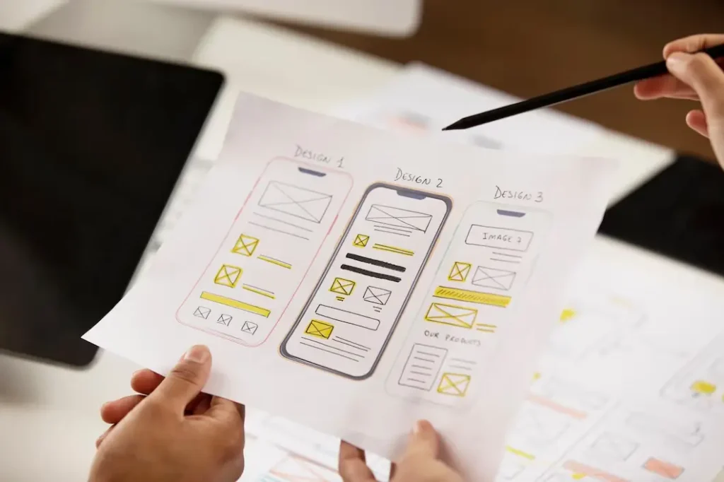
App wireframing creates the structural foundation before the visual design begins. They focus on functionality rather than aesthetics.
Low-Fidelity Wireframes
Sketch basic screen layouts with simple shapes and placeholder text. Focus on content hierarchy, spatial relationships, and core functionality. According to UX Planet research, projects starting with wireframes reduce development time by 25%.
Tools of the Trade
Several excellent wireframing tools exist for different needs:
- Figma: Collaborative and web-based with robust features
- Sketch: Mac-focused with an extensive plugin ecosystem
- Adobe XD: Cross-platform with integrated prototyping
- Paper and pencil: Still incredibly effective for quick iteration
Testing Wireframes
Get early feedback on wireframes before investing in visual design. Use simple A/B tests with potential users when possible. Invision’s 2023 Product Design Report shows that early wireframe testing reduces redesign needs by 38%.
Pro Tip: Present wireframes to stakeholders in an interactive format. This prevents confusion about functionality versus final appearance.
Creating Visual Design: Making It Beautiful
Visual design transforms structural wireframes into engaging experiences. Several elements require careful attention.
Color Psychology
Choose a color palette that evokes appropriate emotional responses. Consider cultural implications of color choices in global markets. Research by the University of Winnipeg found that color influences purchase decisions within 90 seconds.
Typography Selection
Select readable fonts that match your brand personality. Maintain a strict hierarchy with no more than 2-3 font families. Google’s Material Design guidelines recommend a minimum 16px font size for body text.
Visual Hierarchy
Guide users’ attention through careful element sizing and positioning. Make important elements stand out through contrast or animation. Eye-tracking studies from Nielsen Norman Group confirm that users scan content in F-patterns.
Consistency is Key
Create a comprehensive design system with reusable components. Document spacing, sizing, and interaction patterns for development. Maintain visual consistency across all screens and states.
Prototyping: Bringing Designs to Life
Prototyping transforms static designs into interactive experiences. This critical step validates user experience before development begins.
Fidelity Levels
Choose appropriate prototype fidelity based on testing goals:
- Low-fidelity: Tests basic navigation and flows
- Medium-fidelity: Validates interactions and transitions
- High-fidelity: Evaluates visual design and animations
Interactive Elements
Create realistic interactive components that respond to user input. Include hover states, animations, and transition effects. Simulate actual app behavior as closely as possible.
Testing Protocols
Conduct moderated testing sessions with 5-7 representative users. Assign specific tasks and observe completion difficulties. Record sessions for team review and pattern identification.
According to UXCam research, apps that undergo prototype testing see 25% higher retention rates after launch.
Designing for Accessibility
Inclusive design expands your user base while improving experiences for everyone. Several key considerations ensure broader accessibility.
Color Contrast
Maintain WCAG 2.1 AA standard contrast ratios (4.5:1 minimum). Test designs with color blindness simulation tools. WebAIM reports that 86.3% of home pages fail contrast requirements.
Touch Target Sizing
Create touch targets measuring at least 44×44 pixels. Space interactive elements appropriately to prevent mis-taps. Apple’s Human Interface Guidelines recommend 44pt minimum touch targets.
Screen Reader Support
Add meaningful alt text for all informational images. Structure content with proper heading hierarchy for screen readers. Create a logical tab order for keyboard navigation.
Expert Insight: “Accessible design improves usability for everyone, not just users with disabilities.” – Nielsen Norman Group
Micro-Interactions: The Magic Details

Small interactive moments create emotional connections with users. These details differentiate great apps from good ones.
Purposeful Animation
Use subtle animations to provide feedback and guide attention. Keep animations under 400ms for a perceived instantaneous response. Limit motion to prevent cognitive overload or distraction.
Feedback Mechanisms
Provide immediate feedback for all user actions. Use haptic feedback for important actions when available. Include visual confirmation for form submissions and key tasks.
Loading States
Create engaging loading states that reduce perceived wait time. Show progress indicators for operations exceeding 1 second. Skeleton screens improve perceived performance, according to Viget research.
Preparing for Development
Bridge the gap between design and development with proper documentation. Several deliverables ensure smooth implementation.
Design Specifications
Create detailed specs documenting exact measurements and properties. Include component states, spacing guidelines, and grid specifications. Provide responsive behavior instructions for different screen sizes.
Asset Preparation
Export images in appropriate formats and resolutions. Prepare assets for both iOS and Android platforms. Include dark mode variations when applicable.
Design System Documentation
Create a comprehensive library of reusable design components. Document usage rules and variations for each element. Include code examples when possible for developer reference.
Testing and Iteration
Design work continues through development and beyond initial release. Several testing approaches inform ongoing refinement, and collaborating with a skilled UX design agency can help interpret user feedback, run usability tests, and fine-tune the product for better user experience over time.
Usability Testing
Conduct formal usability tests with target audience members. Identify friction points and unexpected user behaviors. According to Forrestor Research, fixing a problem after development costs 100x more than during design.
Analytics Integration
Plan for analytics implementation during the design phase. Identify key metrics that will indicate design success. Heat mapping tools reveal actual user interaction patterns.
Iteration Cycles
Schedule regular design reviews based on user feedback. Plan for ongoing design refinements post-launch. Establish clear criteria for determining redesign priorities.
Conclusion
Mobile app UI design requires a systematic approach and attention to detail. The journey from wireframe to polished product involves multiple disciplines. Statistics consistently show that investment in thorough design processes pays dividends. Users form opinions about apps within milliseconds of first interaction. Make those impressions count through careful design consideration.
Remember that great mobile app design balances business goals with user needs. The most beautiful app fails without solving real problems effectively. Follow these steps to create apps that truly wow users while delivering business results. Or simply hire a reputed company offering UI UX design services and get started without the hassle of hiring, training, and retaining in-house.