

Are you considering using the Responsive theme by Cyberchimps to create your WordPress website?
If yes, be sure to check out this detailed review before proceeding further!
In WordPress, the theme is the basic fundamental block upon which the whole website is developed. A mistake in choosing the right one can literally cost you your whole website.
As a WordPress enthusiast, I continuously look for tools that simplify website building and document them so you can also get the best out of them.
Recently, while building a new website, I tried the Responsive theme. Based on my experience, I have compiled a few key points to consider before using it on your website.
So let’s get started!
Table of Contents
Get Cyberchimps Responsive theme for free.
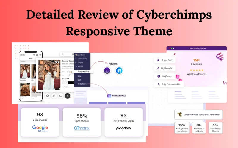
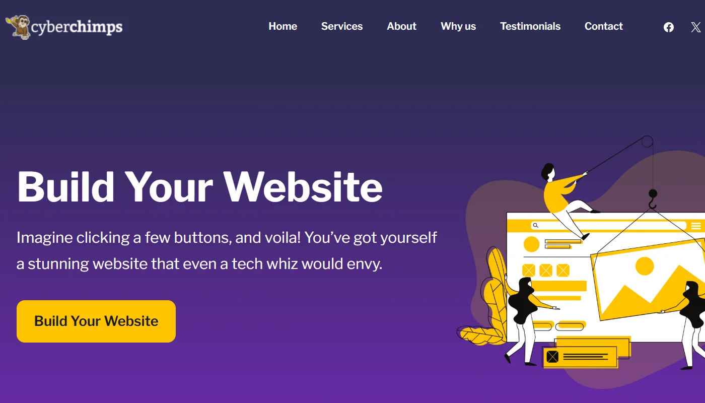
What is Cyberchimps Responsive Theme?
Beginning with the basics first, the Responsive theme was the initial product introduced by Cyberchimps.
It is a free WordPress theme that is currently installed and actively used by over 20,000 users. Based on 500+ ratings on WordPress.org, the theme is rated 4.7/5.
Just like other classic themes, the Responsive theme also aims to provide its users with the best architecture and framework to build a fully fledged website.
However, the theme’s USP is its price proposition that separates it from other classic themes. It features very robust customizer settings, which are typically only available in premium themes.
To understand whether or not the Responsive theme is the right fit for you, I have reviewed it on key parameters:
- Customization Features
- Performance
- Ease of Use
- Integration and Compatibility
- Support
I have also considered including a section for theme extensions, as it is a vital factor that you may want to consider when making your decision.
1. Customization Features of Responsive Theme
As mentioned previously, the USP of the Responsive theme relies on its theme customizer, which provides users with plenty of options when building a website.
It allows you access to customize and style every part of your website. I used each of its settings, and based on my experience, I have summarized the setups to help you better understand the product.
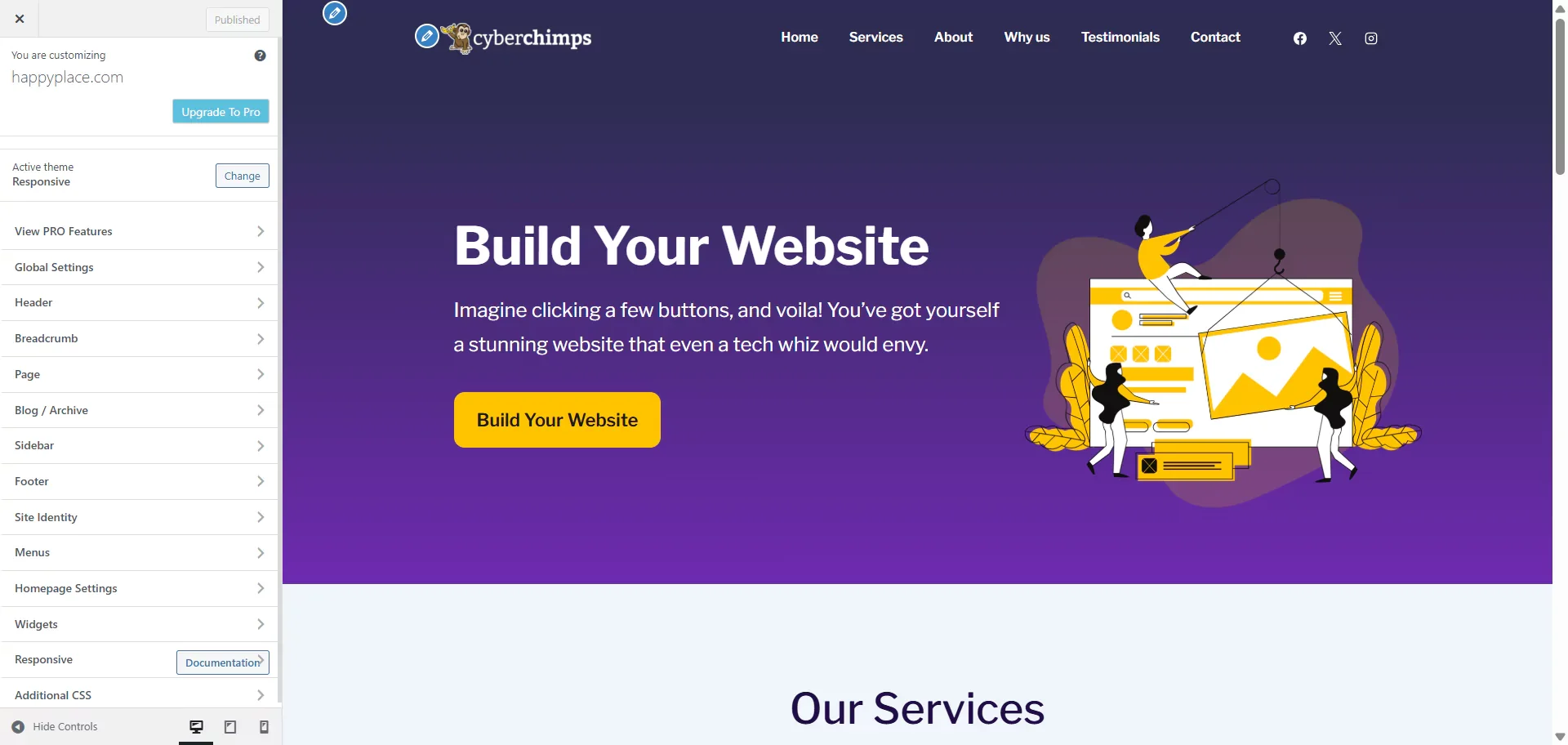
The above image might have already given you a clear idea of the customization settings available in the Responsive theme customizer.
However, when using the theme, you will also encounter some unique, free features within the customizer that most other themes do not offer.
To begin with, the common functionalities are that it offers the standard customization options, like the following:
- Global customizer settings that enable you to customize the global website elements, including the overall site layout, buttons, form fields, colors, backgrounds, typography, social links, and embed scripts.

Additionally, you can also set up the general settings and design of various elements, including:
- Breadcrumb Navigation
- Page Layouts
- Adjusting Home and Post Page Settings
- Creating Site Identity
- Building a Menu
- Adding Widgets to the Website
Alongside the common customizer settings, the Responsive theme customizer also boasts some unique features, including:
- Header Footer Builder
- Blog Layout Customization
- Color and Typography Presets
Now let’s look at these unique features in detail.
Header Footer Builder
The Responsive Theme’s header and footer builder simplifies building a header and footer for your website.
This feature comes with an intuitive drag-and-drop setup, allowing you to drag different widgets or elements to their respective parts of your header or footer.
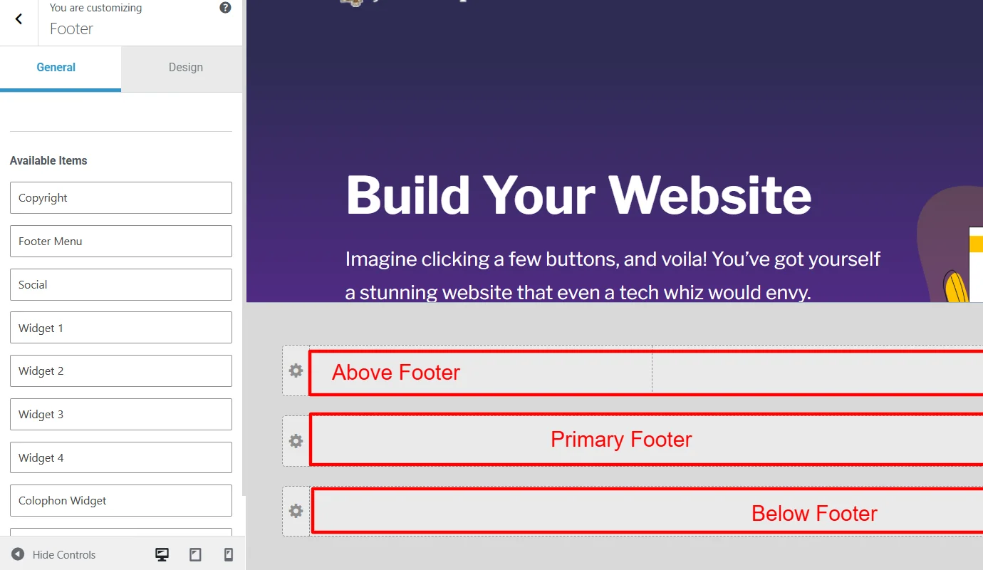
Additionally, the setting also lets you change its general settings and comprehensively style the appearance of each element after you add it to your website.
Other themes, such as Astra and Kadence, also offer a header and footer builder; however, this feature is only available with their paid versions.
Blog Layout Customization
While you might think of blog layout customization as a standard feature in all classic themes, the Responsive theme customizer offers additional settings.
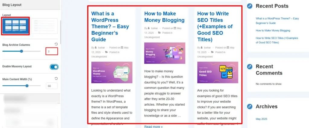
It allows you to set up the overall post page appearance, where you can display six posts in each row, adjust the meta elements to display for each post, and also add a masonry layout. This feature completely hooked me as it was completely free.
Color and Typography Presets
The color and typography presets of the Responsive theme are the customization options that impressed me the most. It’s primarily designed for new users or those with limited design knowledge to set up the background.
You can also edit the color and font configuration of elements across different headers on the website.
Basically, the feature works like a filter or effect. To do this, simply select one of the available presets, and the customizer will apply the chosen preset’s color or font to your entire website.
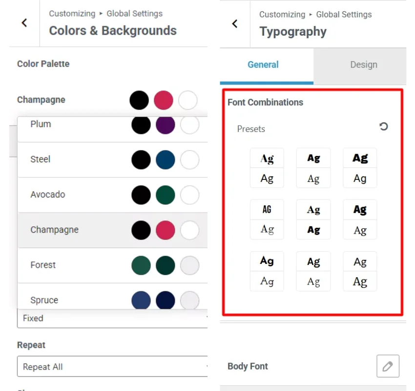
Additionally, you can also use presets with other combinations, thereby helping you make a unique website.
2. Theme Performance
The performance of a theme plays a crucial role in determining the overall reliability, speed, and performance of your website in the future.
While most WordPress themes promote themselves as lightweight and fast theme, you must check them on specific parameters. I mostly rely on two parameters to determine the performance:
- Technologies and libraries used to develop the theme
- Running a performance test after using the theme and its features on a staging site
The technologies used for building a theme help you understand the fundamental building blocks and whether it can meet your requirements.
For Responsive, although the information about the technology used is not directly mentioned on their site, you can confirm this by raising a pre-sale support ticket.
I personally fetched the information about the theme, and here are the details. The theme utilizes WordPress as its core technology. Additionally, coding libraries such as React, JavaScript, HTML, CSS, jQuery, Backbone.js, Babel, Webpack, Sass, and PHP have been deployed to develop the Responsive theme.
According to current development standards, all the libraries used are considered optimal and efficient resources, so from a technological perspective, the theme is reliable.
Additionally, as mentioned in the performance test, I took a test with Google PageSpeed Insights, which provided a detailed perspective on the core web vitals. The results of the same are visible as below:
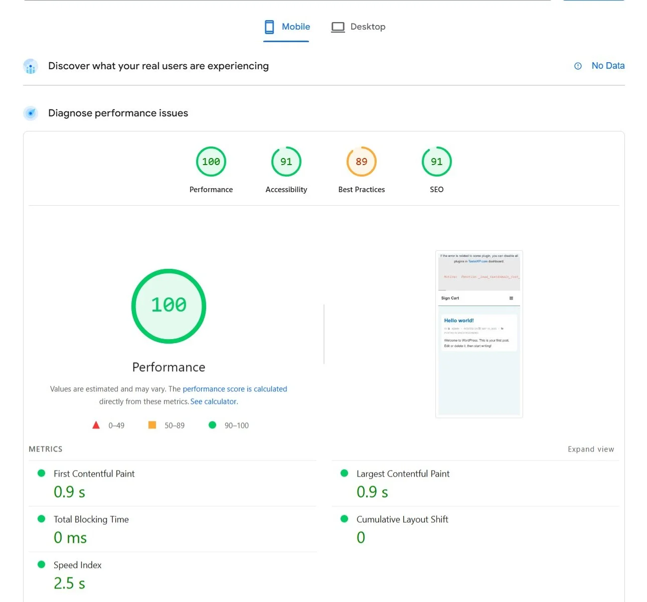
As it’s clear, the use of Cyberchimps Responsive theme on a website boasts healthy core web vitals, suggesting it’s a good choice in terms of performance.
3. Ease of Use
When considering the ease of use, I found the theme to be user-friendly and relatively easy to use.
The configuration and customization were relatively simple with an intuitive interface. Additionally, something that really makes the theme customization simpler is its Live first user screen feature.
It is a unique feature offered only by selected classic themes, and Responsive is one of them. It provides a side-by-side, real-time interface that gives you an instant idea of the changes and customizations you make across the website.
This feature makes website building a playful and easy experience. Additionally, the customization labels are straightforward and clear, which helps avoid confusion among users as they explore the theme.
4. Integration and Compatibility
In terms of integration and compatibility, I did not encounter any significant challenges integrating the theme with popular page builder plugins, e-commerce extensions, or other relevant tool plugins.
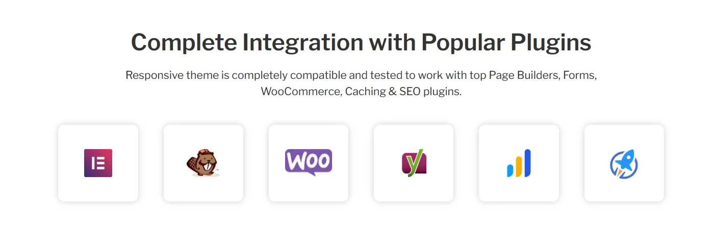
Moreover, the theme has additional extensions that enhance its usage when specifically integrated with Elementor and WooCommerce. We will explore these extensions in detail in the coming sections.
5. Support
When building a website, the role of support is of utmost importance. Technical products like website themes might often encounter bugs and issues caused by product updates or improvements.
Under such circumstances, a part of your overall website can encounter an issue or break, for which a quick resolution would be to reach out to the support team and get it fixed.
Regarding the support offered by Cyberchimps, it was helpful overall. They provide personal support to resolve your query, either by raising tickets or by directly emailing them at [email protected].
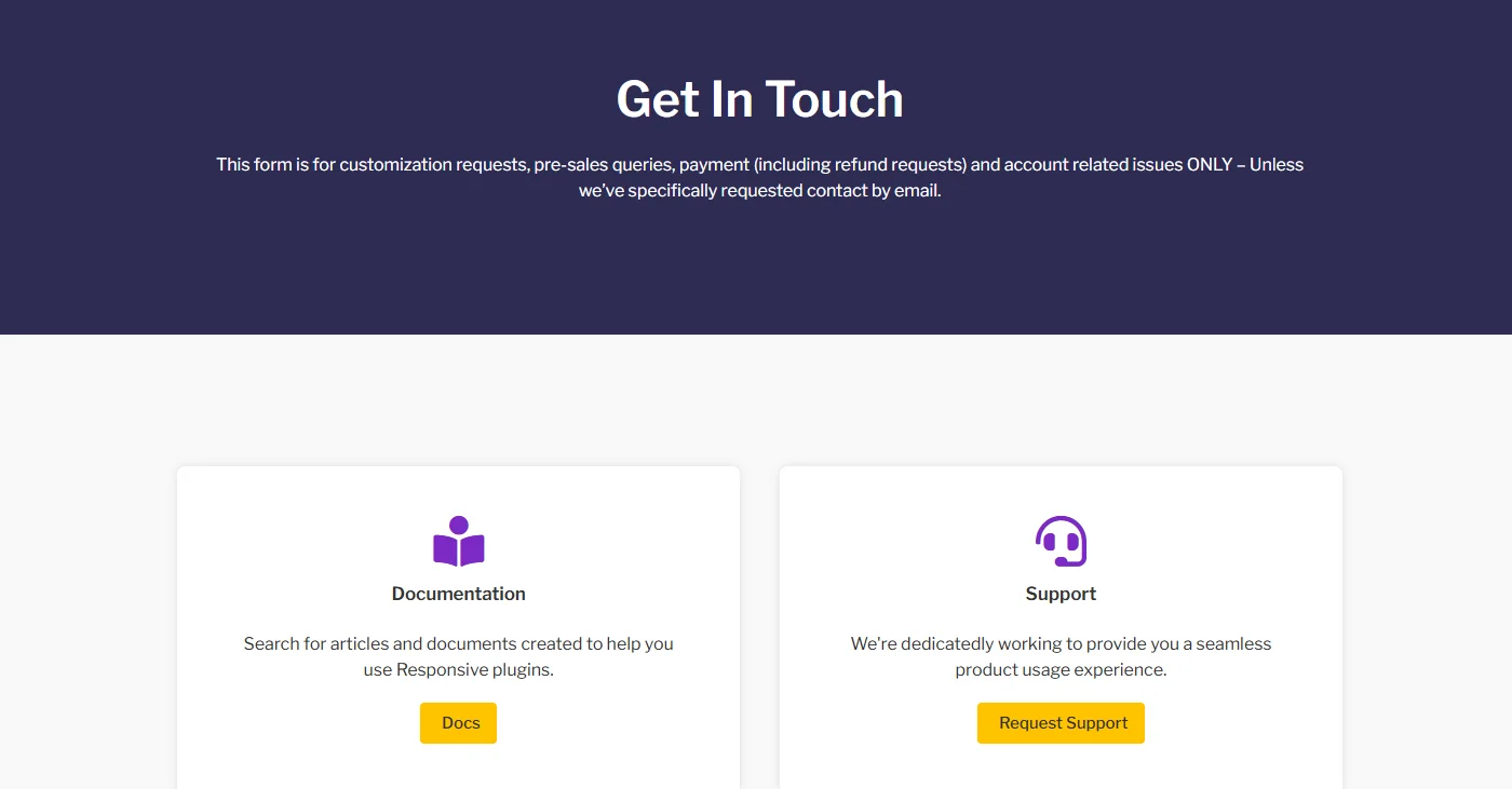
Although I did not take any direct assistance from the support team via tickets, reviews suggest the average response time of the support team is within 12 hours.
In addition to ticketing support, it also offers comprehensive documentation and video tutorials to understand the usage of each feature.
Responsive Theme Extensions
Alongside the inbuilt customization options of the Responsive Theme, Cyberchimps has also worked over the years on building sister plugins that act as extensions for the theme.
These extensions are openly available as plugins that function independently; however, when used with the Responsive theme, they provide users with advanced website-building options.
1. Responsive Plus – Starter Templates
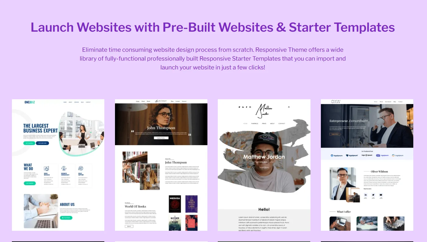
Talking about the first plugin, it’s the Responsive Plus – Starter Templates plugin. It is a freemium plugin, and as its name suggests, the primary purpose of the plugin is to provide users with 250+ readymade website templates for Elementor and Gutenberg.
If you are using Elementor or Gutenberg as your page builder and do not wish to build your website from scratch, you can use this plugin to choose a template under any niche and create your website with a single click import.
Once the template is imported, you can further customize its appearance to suit your needs. Although the plugin can function independently with any theme, its integration with the Responsive theme provides you with free additional features, including:
- Mega Menu Builder
- White Labeling
- Custom Fonts Integration
- Advanced WooCommerce Options
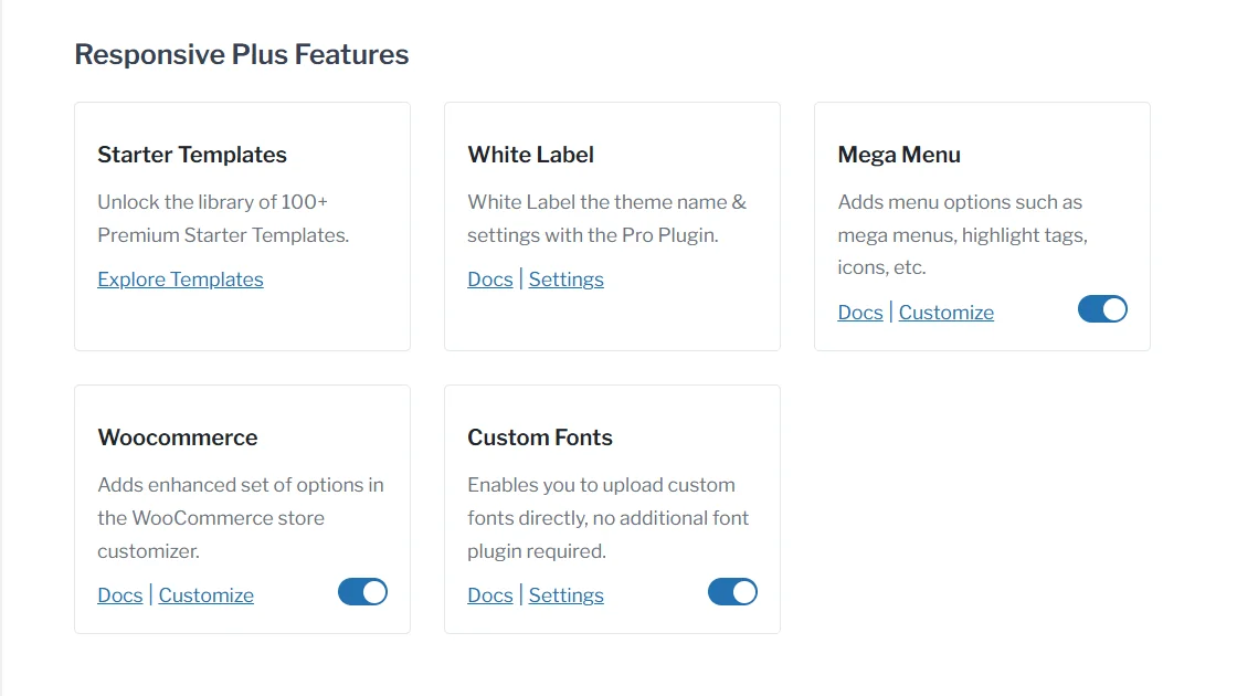
These features work exactly as their names suggest and do not require you to add any additional plugins for separate functionality.
To learn about the plugin in depth, you can refer to: Detailed Review of Responsive Plus – Starter Templates Plugin
2. Responsive Addons for Elementor
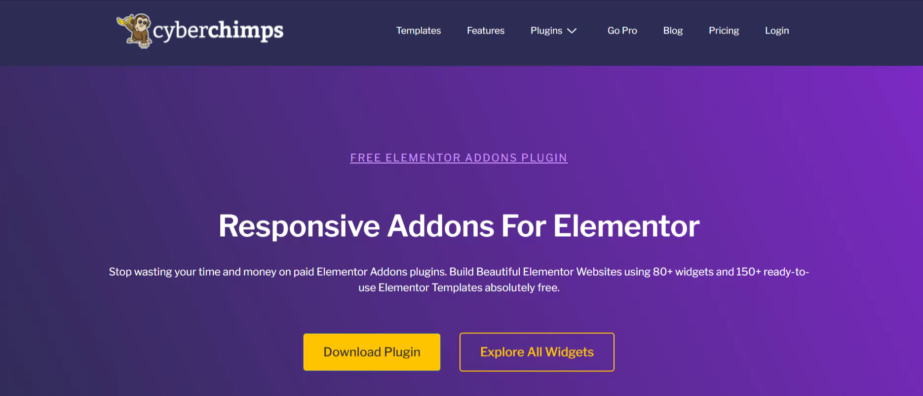
The Responsive Addons for Elementor (RAE) is a separate free WordPress plugin developed for websites built using Elementor or Elementor page templates.
Once you build a website with Elementor, to further add a new feature or interactive functions, widgets are required. Although Elementor offers its own set of widgets that allow you to add a variety of functions, most of them require its pro version to access.
The Responsive Addons for Elementor sort out the requirement of Elementor Pro to access those widgets. The plugin offers 80+ free widgets that cover the widgets offered by Elementor.
Moreover, you also get additional widgets that are unique only to Responsive Addons for Elementor.
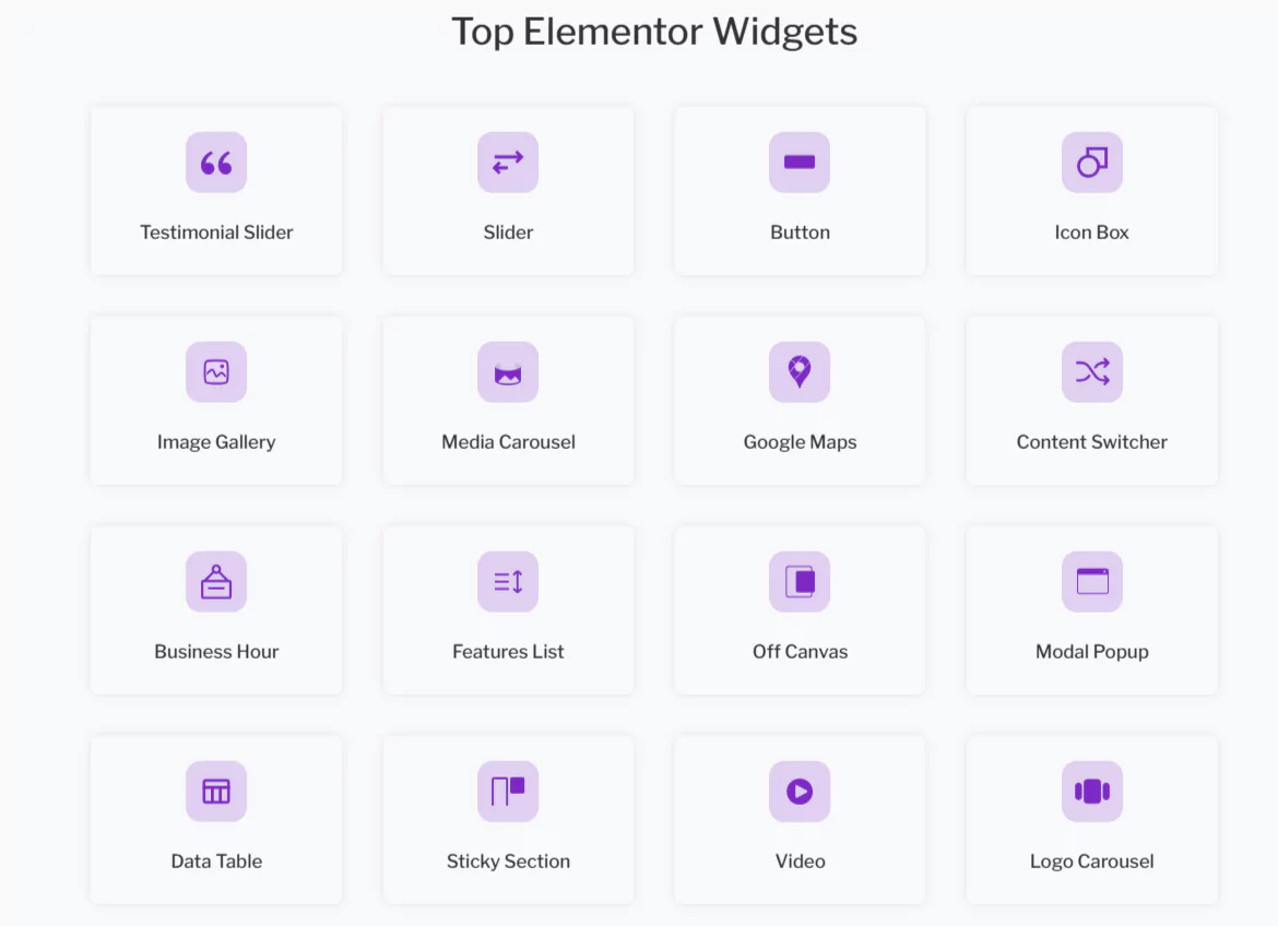
Further, these widgets empower users with extensive customization capabilities. I have personally tried both Elementor Pro widgets and RAE widgets, and found Responsive Addons for Elementor widgets to be better and useful.
3. Responsive Blocks
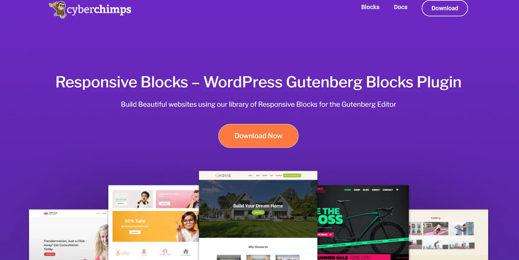
Similar to Responsive Addons for Elementor, Responsive Blocks is a free WordPress plugin developed by Cyberchimps for users who are building ot built their websites using the Gutenberg Page builder.
Previously known as the Classic Editor, Gutenberg is the default page builder included with WordPress installations. Similar to Elementor widgets, if a user wants to add advanced functions within their Gutenberg website, they need to use the WordPress blocks.
However, these WordPress blocks are very limited in number and offer significantly fewer customization options. Responsive Blocks addresses this challenge by offering users over 50 free Gutenberg blocks to enhance their website’s features.
Similar to RAE widgets, these blocks are also customizable and flexible, allowing for modification according to user requirements.

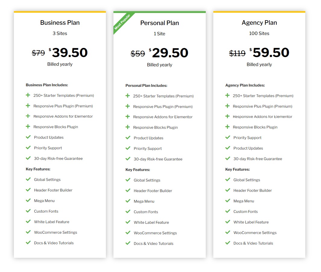
Responsive Theme Pricing
Responsive theme is basically free and offers all its features and customization options without any cost.
However, Cyberchimps offers the Responsive theme along with the three plugins as mentioned earlier. The complete WordPress toolkit goes by the name Cyberchimps Responsive Platform.
If you want to get access to all the features, including the Premium templates in Responsive Plus, you can try the Cyberchimps Responsive Platform that starts at an annual price of $29.50.
In my opinion, this is an excellent purchase for all WordPress users. When compared with most popular solutions, the Cyberchimps Responsive Platform stands out in its way and is much more affordable than its counterparts.
FAQ:
What is Cyberchimps Responsive Theme?
Cyberchimps Responsive theme is a free, flexible WordPress theme designed for easy website building. It offers extensive customization options and unique features to build a website from scratch.
How to Choose a WordPress Theme?
When choosing a WordPress theme, look for ease of customization, performance, compatibility with plugins, and reliable support.
How to Customize a Website Using a WordPress Theme?
You can customize a website using the built-in WordPress customizer. With the Responsive theme, this includes global settings, a drag-and-drop header/footer builder, layout presets, color and typography options, and real-time live previews.
Who Can Use Responsive Theme?
Responsive Theme is suited for anyone, such as bloggers, business owners, freelancers, or developers, who want to build a WordPress website efficiently.
Is Responsive Theme Free to Use?
Yes, the Responsive Theme is free. However, you can also extend its capabilities with advanced sister plugins that come as part of the Cyberchimps Responsive Platform, starting at $39.50/year.
Is It Worth Using The Responsive Theme?
So, based on my overall usage of all the customization options and features that come with the Responsive theme, it is definitely worth trying.
Additionally when combined with other its sister extensions the theme works like a full-fledged website-building toolkit. Therefore, I would recommend keeping it as an option when building your website.