
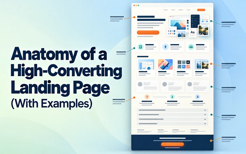
A landing page can look polished and still leave visitors unsure what to do next. The offer might be clear, but the next step is buried. Or the button appears before readers understand what they will receive.
Building a high-converting landing page starts with checking what each section helps visitors decide. Missing information and misplaced sections can interrupt that decision, even when the design looks good.
This guide breaks a landing page into nine parts that follow the visitor’s reading journey. You will see a DealFuel landing page generated using an AI prompt, other pages worth studying, and copy changes you can adapt.
The structure supports clearer decisions; your results still depend on your offer, audience, and testing.
The Page at a Glance:
Our running example is a generated landing page for DealFuel Software Deals & Digital Resources. It encourages visitors to explore deals and find tools that fit their work. DealFuel is a real business; this layout is a draft created using the playbook’s prompt, not a screenshot of its live homepage or a measured conversion success. Browse the ten carousel slides to see the complete draft. The numbered annotations identify nine core elements: the hero contains the first three, and the final slide contains the last two. The problem, solution, features, and “Why DealFuel” slides provide supporting context. The numbers identify elements, rather than a mandatory section order.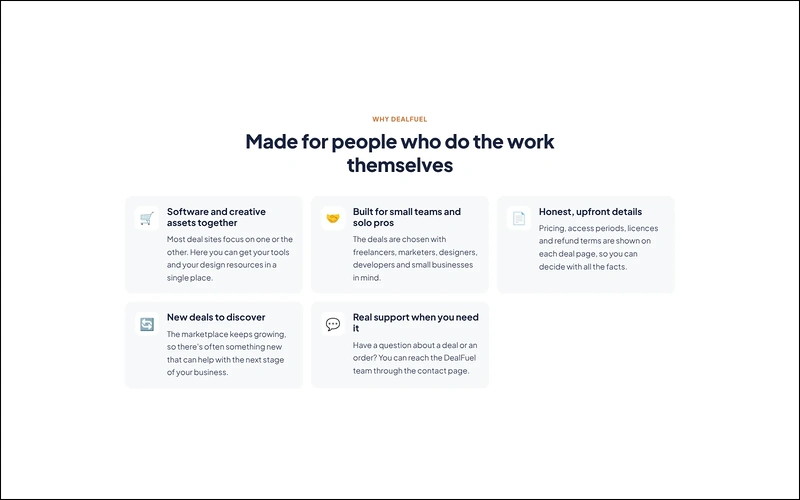
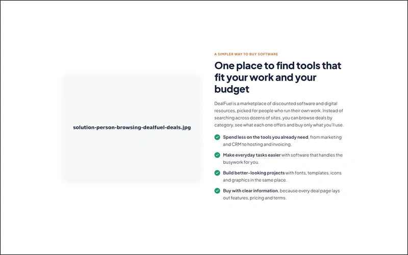
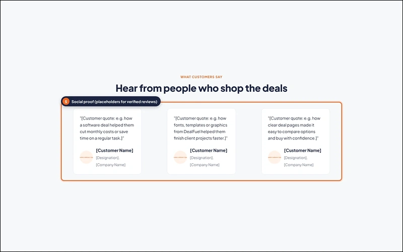
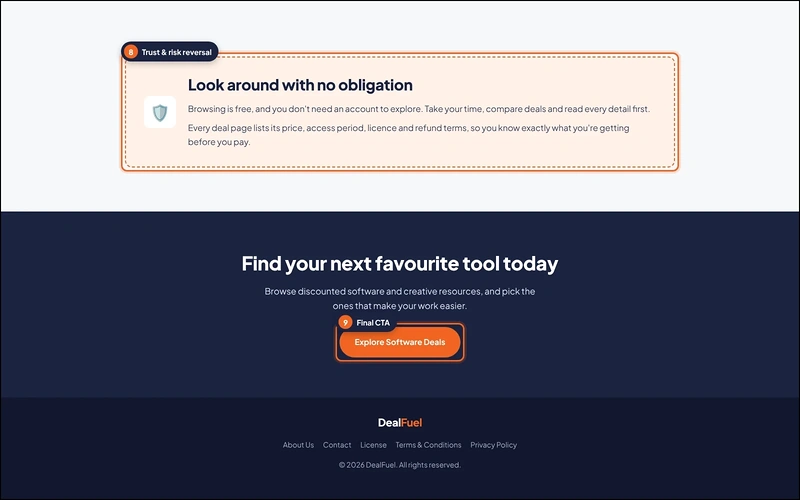
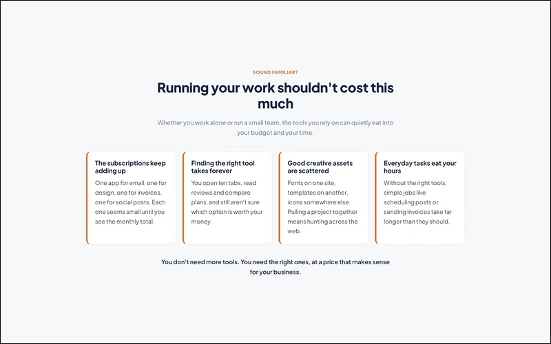
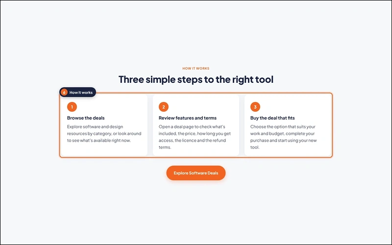
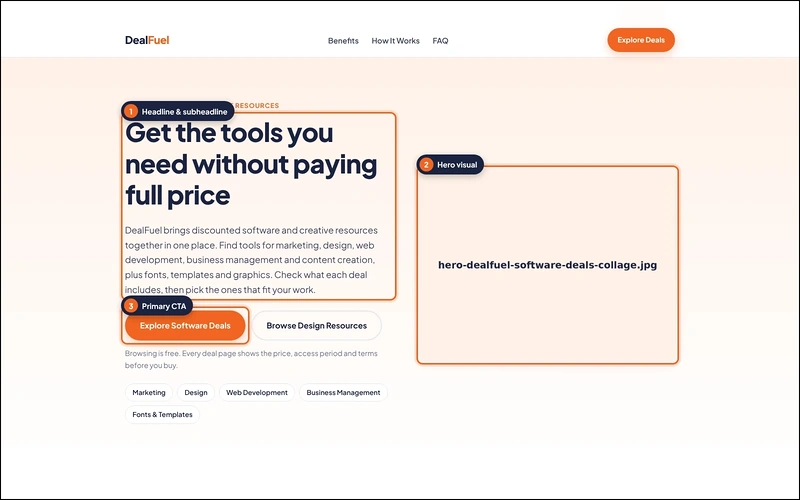
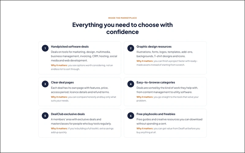
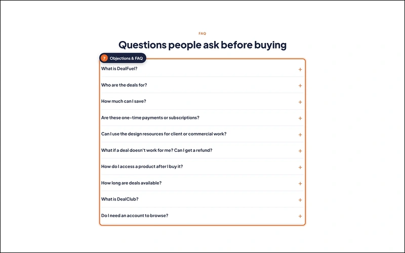
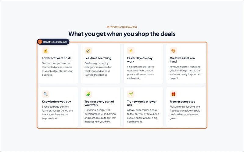
Generated DealFuel landing page example. Image and testimonial placeholders show where genuine assets and verified customer feedback belong.
The Nine Sections of a High-Converting Landing Page:

1. Headline and Subheadline:

What it does: The headline identifies the main value. The subheadline explains the offer, audience, and scope so visitors can quickly judge whether it fits.
Example: The DealFuel draft opens with “Get the tools you need without paying full price.” Its supporting copy introduces discounted software and creative resources, then names the types of work they support. Visitors can quickly understand the offer and why its matters.
Before: “A Better Solution for Your Business.”
After: “Get the tools you need without paying full price.”
Match this promise to the ad, email, or search result bringing visitors in. If your campaign promotes software deals, the opening should immediately confirm that offer.
Common slip: Writing a clever slogan that could describe almost any company.
2. Hero Visual:

What it does: The hero visual makes the offer easier to picture. It should show the product, service deliverable, or experience behind the headline.
Example: The DealFuel hero reserves space for a software-deals collage. The current slide shows a filename placeholder, not a finished visual. Replace it with genuine product screenshots or recognizable resource previews that support the headline.
For a physical product, show it in use. For a service, show a real deliverable or a simple process preview.
Common slip: Choosing a decorative stock photo that explains nothing. A generic workspace photo says little about the tools or resources visitors can explore. Keep the visual relevant, compress it, and check that its details remain readable on a phone.
3. Primary CTA:

What it does: The primary call to action tells visitors what they can do next. Its label should match the action and destination.
Example: The DealFuel draft uses “Explore Software Deals” on a prominent orange button. The secondary “Browse Design Resources” button has a lighter outline. Both support shopping, but the visual hierarchy makes the primary route easier to spot.
Before: “Submit.”
After: “Explore Software Deals.”
The revised label makes the next step clearer. Link it directly to the relevant deals listing, rather than an unrelated signup form.
Shopify’s free-trial page is a useful real example: an email field appears beside the initial trial invitation, and another appears later. Both support the same signup journey.
Common slip: Giving equally prominent buttons to buying, subscribing, and booking. Choose one primary conversion goal, then make its path obvious.
4. Benefits as Outcomes:

What it does: Benefits connect what you provide with what visitors can accomplish. Features supply the detail that makes those benefits believable.
Example: The DealFuel benefits slide uses headings such as “Lower software costs,” “Less time searching,” and “Creative assets on hand.” The features slide then explains what supports those benefits, including browsable categories and graphic design resources.
Use a short benefit heading, followed by an explanation of how you deliver it. Avoid vague claims about effortless success. For example, grouped categories can help visitors narrow their search. Avoid promising a fixed time saving unless you can support it.
Grammarly’s homepage provides a useful writing example. Its feature descriptions connect writing assistance with practical tasks, including adjusting tone and improving clarity.
Common slip: Listing technical features and expecting visitors to translate them into value. Explain the everyday difference each important feature makes.
5. Social Proof:

What it does: Social proof helps visitors assess your claims using evidence from other people. Useful formats include permission-based testimonials, attributable reviews, and documented customer stories.
Example: The DealFuel testimonials slide contains three clearly marked placeholders for verified reviews. Each includes fields for a customer’s name, designation, and company. These show the intended layout; they are not actual testimonials or evidence of customer results.
Shopify’s trial page includes a named customer testimonial.
Common slip: Publishing an AI-generated testimonial because the layout needs one. Never invent endorsements or imply that a demonstration is customer evidence. If you lack social proof, remove that section and offer a clearly labeled work sample instead.
6. How It Works:

What it does: This section makes the process predictable. It shows what visitors must do and what your business will handle afterward.
Example: The DealFuel draft uses three steps: “Browse the deals,” “Review features and terms,” and “Buy the deal that fits.” The middle step asks shoppers to check the price, access period, license, and refund terms before purchasing.
Keep each step short, but include meaningful conditions. Where a product requires code redemption or account activation, explain that on its deal page.
Common slip: Describing only your internal workflow. Visitors need to understand their own effort, timing, and next milestone. Replace vague steps such as “Experience the magic” with actions they can picture and complete.
7. Objections and FAQ:

What it does: FAQs address the practical questions that can stop a visitor from taking the next step. Choose questions from actual inquiries where possible.
Example: The DealFuel FAQ slide raises questions about one-time payments versus subscriptions, commercial use, refunds, and product access. These topics address buying decisions. The screenshot shows collapsed questions, so check the actual answers before publishing.
Shopify’s trial page answers questions about pricing, domains, and the skills needed to use its platform. These topics help potential users judge suitability before they start. Use the same principle when choosing questions for your own offer.
Common slip: Filling the FAQ with promotional questions that nobody asks. “Why are we the best?” adds little. “How do I access a product after I buy it?” helps visitors assess the commitment. Keep essential pricing and eligibility details near the offer, too.
8. Trust Signals and Risk Reversal:

What it does: Trust signals establish who stands behind the offer. Risk reversal explains any genuine terms that reduce the visitor’s commitment or uncertainty.
Example: The DealFuel draft uses “Look around with no obligation” to frame browsing as a low-commitment first step. It directs readers to review deal terms before paying. The footer also includes contact, license, terms, and privacy links that must lead to the correct pages.
Free browsing is reassurance, not a money-back guarantee. Use only policies you can honor. A refund promise should explain eligibility, timing, and exclusions. A service without refunds can still clarify scope, approval steps, and cancellation terms. Relevant professional credentials may help, but only when accurate and verifiable.
Common slip: Adding generic security badges or broad guarantees without supporting facts. Do not claim certification, regulatory compliance, or protected payments because an AI draft suggests it. Verify every trust statement with the business owner.
9. Final CTA:

What it does: The final CTA gives readers a clear next step after they have reviewed the offer, evidence, process, and conditions.
Example: The DealFuel draft closes with “Find your next favorite tool today” and repeats “Explore Software Deals.” The dark background separates this final invitation from earlier content, while the orange button keeps the main action visually consistent.
Before: “Contact Us to Learn More.”
After: “Explore Software Deals.”
The stronger version preserves the page’s original goal.
Common slip: Introducing a newsletter signup or unrelated discount at the end. Finish with the offer visitors came to evaluate. Use deadlines or limited availability only when they are real and explainable.
How do the Supporting Sections Connect?

- The carousel also shows how a longer page builds its case.
- The problem slide highlights rising subscription costs and time spent searching.
- The solution slide introduces one place to explore software and creative resources.
- Benefits describe the value, while features explain what is available.
- The “Why DealFuel” slide then focuses on audience fit, information, and support.
Each section should add something useful, rather than repeat the same savings claim.
Check broad comparisons and promises in AI-generated copy before publishing them.
Page-Level Basics That Support the Structure:

Give the page one primary goal. Reduce unnecessary navigation while keeping essential contact, privacy, and legal information accessible.
Check mobile layouts carefully. Stack sections in a sensible order, use readable text, label form fields, and make buttons easy to tap. Test keyboard navigation and the confirmation shown after submission.
Keep images lightweight and remove unnecessary scripts. Test loading speed on a real phone, then check every button, form, and destination link.
For an audit of an existing page, read DealFuel’s guide to landing page mistakes. Track completed bookings, purchases, or signups alongside traffic quality; button clicks alone do not prove that the page works.
Frequently Asked Questions
How long should a landing page be?
A landing page should be long enough to explain the offer and answer meaningful objections. A simple offer may need little detail, while an expensive service needs more context. Start with what visitors need to decide, then remove repetition and test whether the page supports completed conversions.How many CTAs should it have?
Use one primary conversion goal, with the same action repeated where useful. A short page may need one prominent button; a longer page may repeat it near the top and bottom. Keep labels and destinations consistent, and avoid giving unrelated actions equal visual weight on the page.What is the difference between a landing page and a homepage?
A homepage introduces the broader business and helps different visitors find what they need. A campaign landing page focuses on one offer for a specific audience and encourages one main action. It usually needs fewer navigation choices, with enough offer details to support that particular decision confidently.Build Your Landing Page Faster With AI:

Writing every section from scratch takes time, so many pages launch with gaps.
DealFuel’s free Landing Page Playbook speeds this up. Answer a few questions about your business, audience, and goal, and it builds a prompt for ChatGPT or Claude. That prompt creates a draft covering all nine sections above.
Open the free Landing Page Playbook and get ready-to-embed HTML in about an hour. No download required. Swap in real images and reviews before you publish.