
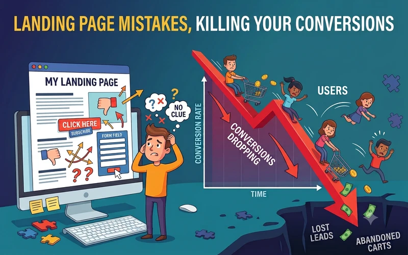
Your ads are running. Traffic is showing up every day. But visitors leave without buying, booking a call, or signing up.
That’s frustrating. But it’s rarely a traffic problem. It’s usually a landing page problem, and it’s often fixable.
According to Unbounce’s Q4 2024 benchmark report, the median landing page conversion rate across industries is just 6.6%. The report analyzed over 41,000 landing pages. That’s the midpoint, not a promise of what your own page will hit. Some pages convert far higher, and plenty convert far lower. But the number does tell you something useful. Most pages, even solid ones, lose the large majority of their visitors. So if you’ve been asking why is my landing page not converting, you’re not alone. You’re not doing something wildly wrong, either. You just have a handful of specific, fixable problems to find.
The good news? Landing page mistakes are usually easy to spot once you know where to look. Most of them are visible in seconds, if you know what to check. You don’t need a redesign, a developer, or a new marketing budget to fix them. You just need to know exactly where to look on the page you already have.
Below are six of the most common landing page mistakes. You’ll see why each one quietly costs you customers, and exactly how to fix it. Read through your own page as you go, one mistake at a time.
6 Common Landing Page Mistakes
1. Too Many Competing Calls to Action

Mistake: Open your landing page and count every clickable thing on it. Many pages have a “Buy Now” button, a full navigation menu, and links to social profiles in the footer. On top of that, two or three separate forms often compete for attention.
Why it hurts you: Every extra link is a way for a visitor to leave without converting. When people see too many options, they don’t carefully weigh each one. They freeze, and a confused visitor rarely takes action. Decision fatigue is real, and it’s working against you on every page load.
Fix: Strip the page down to one goal and one call to action. Remove the top navigation menu where possible. Remove sidebar links and footer distractions. Repeat the same CTA two or three times down the page. Just never introduce a second, competing action.
2. A Headline That Describes the Product Not the Benefit

Mistake: Read your headline out loud. If it explains what the product is, like “AI-Powered Landing Page Builder,” it reads like a spec sheet. That’s accurate, but it doesn’t sell anything.
Why it hurts you: Visitors don’t buy features. They buy outcomes and relief from a problem. A headline that only describes your product gives them no personal reason to keep reading. So most of them won’t.
Fix: Rewrite your headline around the result the visitor actually gets. Instead of naming the tool, name the change it creates. “Turn More Website Visitors Into Paying Customers” works harder than any product description ever will.
3. Missing or Weak Social Proof

Mistake: Scroll your page and look for real evidence. No testimonials, no reviews, no client logos, no numbers. Just your own claims about how good the product is, repeated in different words.
Why it hurts you: People trust other people more than they trust a company’s own copy. Without visible proof, your promises sound like ordinary advertising. Visitors hesitate right at the moment they are about to convert.
Fix: Add at least one specific, believable testimonial or trust signal above the fold. A real name, a real result, and a photo build trust in seconds. That beats several paragraphs of persuasive copy.
4. Copy That Lists Features Instead of Outcomes

Mistake: Check your bullet points. If they read like a spec sheet, such as “24/7 support,” “Cloud-based,” or “Fully customizable,” they’re technically accurate. But they’re easy to forget.
Why it hurts you: Visitors skim your page looking for the answer to one question: what’s in it for me? A feature list doesn’t answer that question directly. So people move on without connecting the dots themselves.
Fix: Turn every feature into an outcome written from the visitor’s point of view. Instead of “24/7 support,” write “Get help the moment something breaks, day or night.” Same fact, far more persuasive.
5. Slow Load Time or a Poor Mobile Experience

Mistake: Open your own page on your phone right now. If it takes several seconds to load, that’s a mistake. The same is true if the text is cramped or buttons are hard to tap.
Why it hurts you: Most visitors now arrive on a phone, and their patience is short. A slow or clumsy page loses people before they read a single word of your copy.
Fix: Compress your images and cut any unnecessary scripts slowing the page down. Then test it on your own phone, not just a desktop screen. If a button is hard to tap accurately, a visitor won’t try a second time.
6. No Urgency or Unclear Next Step After the CTA

Mistake: Click your own button and see what happens next. If there’s no confirmation or timeline, that’s a gap. It also means no reason to act today instead of “later.”
Why it hurts you: “Later” almost always means never. Without urgency or a clear next step, visitors mentally shelve the decision. They forget your page exists within the hour.
Fix: Add a light deadline, limited availability, or a clear next step, such as “You’ll get your results in under a minute.” Tell visitors exactly what happens the moment after they click.
How to Fix All of This Faster
Rewriting your headline, CTA, proof section, and mobile layout manually takes time. That’s exactly why most pages never actually get fixed, even after you know what’s wrong.
DealFuel’s free Landing Page Playbook skips that entire process for you. Answer a few questions about your business, and generate a landing page that avoids all six mistakes above.
Open the free Landing Page Playbook and get AI-written, ready-to-embed HTML in under an hour — just answer a few questions on the page; no download required.